Anatomy of a Shopping Cart: A Usability Study
development, ajax, usability, ui, ux ·This little writeup is a usability study of cart layout and process in general. So many apps today are still sporting the 1999 click-and-reload interface, and times have changed. Users are tired of the old way, embracing the new, and if you’re behind the times you could be losing clients fast.
Shopping Carts are funny, terrible things. The less intuitive they are, the higher the abandon rate, and yet you have to pack a ton of stuff in there. The trick is to anticipate user workflow, and match that as much as possible, without making the user work for it too much. This is the whole precept behind Don’t Make Me Think.
First things first, create a method for detecting JavaScript prior to a user ever coming to the shopping cart, as it redefines the experience for the user entirely. If JavaScript isn’t present, then it’s either a bot, some non-Class A mobile device, or less than 1% of the desktop user. Surfing the web without JavaScript is even less of a chance than a user surfing without the Flash player. There’s just too much of a user experience that is lost without it, and most standard users don’t have a clue how to disable it to begin with.
You end up with two separate cart processes, one with JavaScript, and one without. “Two processes?” Well, you write a process with graceful degradation, that can do what needs to be done in either scenario, and with code reusability in mind. This writeup will go over the user with JavaScript enabled.
I’ve mocked up a simple, yet effective, cart design. This is just a wireframe model, but there’s nothing here that can’t be done with HTML and CSS. A user without JavaScript would have to step through the stages of placing an order, screen by screen. A user with JavaScript has to step through as well, but through JavaScript and Ajax, this user does most of their work right from the cart.
Below is the mockup, with an explanation of the different stages of process to follow:
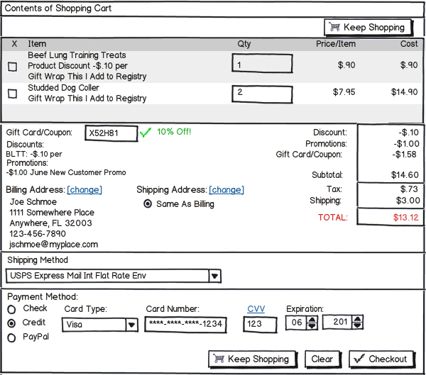
This is pretty loose. Balsamiq only allows you to do so much, so color and highlights and icons give things a lot more pizazz, but this should give you a good idea. If you’re unfamiliar with Balsamiq, it’s a great tool for doing simple “pen on napkin” wireframe layouts during interface design. It’s also a great way to draft quick mockups for clients without spending hours of unpaid time, and even more hours on revisions.
From the top down:
The only button at the top is the “Keep Shopping” button. A user has to verify all the details prior to checking out, so the “Checkout” button is at the bottom of the form. The “Clear” button is also at the bottom, giving the user a second chance not to clear out. A second “Keep Shopping” button is at the bottom of the page, to encourage the user to buy more.
Next up is the cart contents. A user, coming to the cart, wants to know what’s in it first. This is the user’s main focus, so registering for the site or entering credit details and stuff always comes after the cart itself.
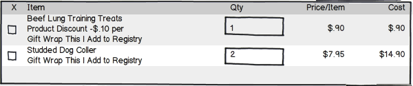
There are a few different ways to handle actions on cart items. Here I show the ‘Remove’ checkbox. If a user hits the box, take the item out. Don’t prompt ‘Are you sure?’ This annoys users. Of course they’re sure, or they wouldn’t have checked the box. Another way of handling ‘Remove’ is part of an action link list. There are already two other action links showing (Gift Wrap and Add to Registry), it would be easy to adjust the layout to use all action links instead (Remove at the top, Add to Wishlist, Add to Registry, with Gift Wrap last). Here’s a tip though: Any of these actions will ultimately remove the item from the cart.
Being tabular in nature, it’s best to use a table here. Unwritten rules of cart usability: the ‘Item’ is listed first, unless something small, like a checkbox, radio button, or icon precedes it. The cost (Qty * Price) is always last. This allows us to build a columnar layout of the money details. If you have line item discounts, you may show the math here too, to emphasize what the client is getting. In this mockup, it’s all shown below.
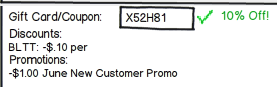
Next, show the user some love. Discounts, Promos, Gift Cards and Coupons should follow the cart. 1) it makes it easier to calculate the Subtotal and 2) it gives the user a warm fuzzy to watch their Total decrease. If there were discounts on items, pull them out here (if you didn’t do it above). Don’t make a user refresh the page to get a new Total. Gift Cards and Coupons? Use Ajax to verify their validity and value, and apply it to the tally block right then.
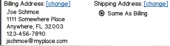
If addresses aren’t pre-populated, then the user hasn’t logged in or registered or set up addresses yet. Our action depends on which scenario is the case. If the user hasn’t logged in or registered, then we show them a login box, with a register button. If they login, we go ahead with the rest of the order process. If they must register, handle that registration in a modal popup and then update your area. If the system allows for anonymous users (those who don’t want, or have, to register with the site), or a registered user hasn’t setup addresses yet, then we display “add address” links to the display that can load modal forms to collect the necessary details.
You can’t tally Tax unless you know you need to collect it. If you don’t have an address yet, don’t show the Tax line item. If you get an address, and tax does need to be applied, add it in right away, and highlight it, and the Total change, so there’s no surprises.
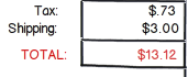
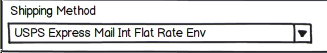
And, once you have an address, then you already know the zip/postal code the order is going to. Once a Shipping Method is selected we can lookup the shipping cost via Ajax. And, if the purchase is a download, then there’s no reason to show them the Shipping line item at all. Avoid the “Estimated Shipping” thing, just give them the info once you have it. If need be, show them text (“We need your address and Shipping Method to show Shipping Cost”) to help push them through the order process.
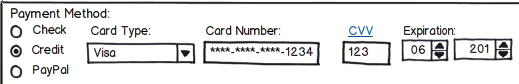
Last is the Payment Method. When a user selects the Payment Method, then the input fields for this area should change to the appropriate fields for that method. Don’t show them fields for every possible option, just those for the option they’ve chosen.
That’s it. By streamlining your Cart and Checkout process to match user workflow, you should see a lower abandon rate and higher sales. There’s a lot of code involved, and both client-side and server-side data validation is a must, for security purposes, but the end gain makes the effort more than worthwhile. What are your suggestions for improving Cart usability?